I may not be a graphic designer, but I've always had an appreciation for beautiful typography and graphics (cannot stand Humanist sans serif types: Verdana and Calibri and the ugliest typeface on earth is Comic Sans). I love vintage, antique, retro serif types or modern, geometric, sleek sans serif types. I really admire Shy's work, because she deals with typography and graphics on a daily basis and her style is very versatile. This semester, she's taking a letterpress class and yesterday, she invited me to join her in the letterpress room.
Letterpress printing was first invented in about 1440 by Johannes Gutenberg, he is credited with the invention of modern movable type printing from individually-cast, reusable letters set together in a form (frame). Letterpress printing became more popular in the advent of the industrial revolution.
In the recent years, I've become very interested in fine arts, being crafty and making art with your hands. This recent realization has made me very frustrated, because this school only allows us three art electives, unless you want to pay for classes that don't go towards your degree. Unfortunately and fortunately, I transferred in five classes from my year in London and three of them were transferred in as art electives. This wasn't finalized until last summer, can you imagine my horror (this was only finalized after my third year here)? Last summer, I had taken one class, one class(!) of Silkscreen and was scheduled to take Book Arts in the fall, but all of my hopes and dreams were crushed after a single phone call and several meetings with my adviser. I was completely heartbroken.
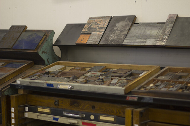
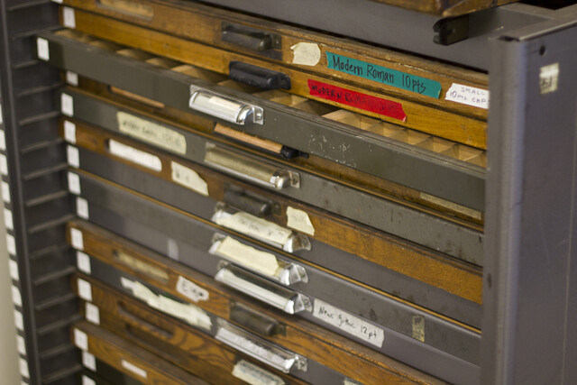
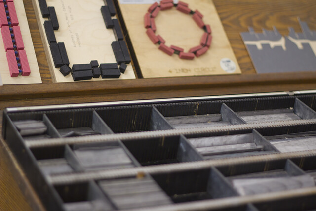
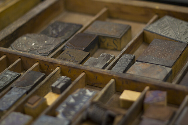
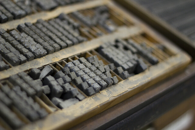
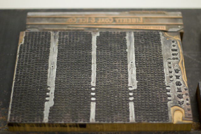
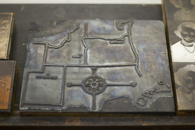
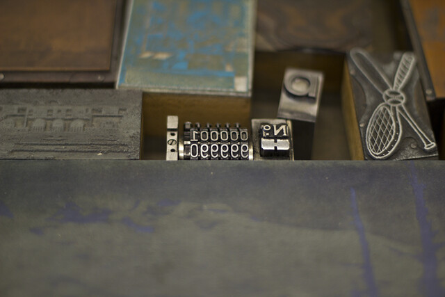
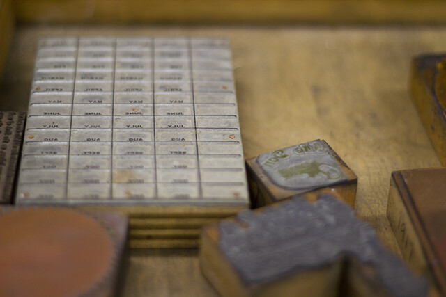
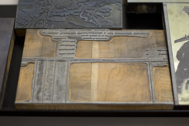
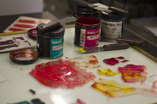
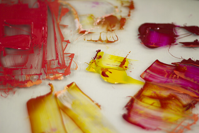
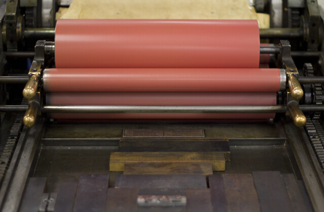
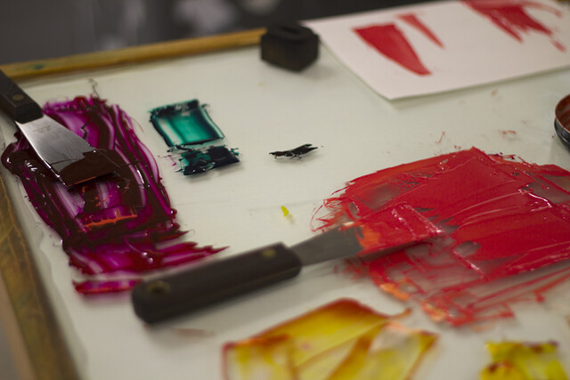
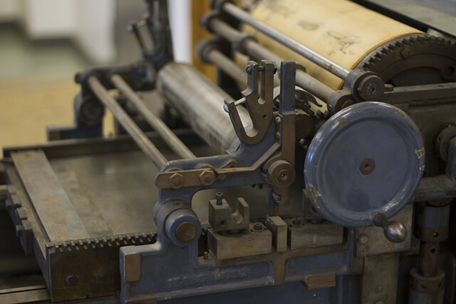
So yesterday, when I went to the letterpress room and saw all the Vandercook printing machines and trays of stencils and type blocks - I was in awe. As fun as letterpress sounds, it is a very tedious and time consuming process. You have the find all the letters from a sea of thousands of letters and different types, then arrange them backwards and fill in the gaps and spaces with leading. The fun part is coming up - the mixing of colors for the ink. I love colors and wish I knew how to paint. I used to do watercolor as a kid, but my confidence as an artist deflated when I went to boarding school. By the time I was 14-15, my artistic confidence was non existent, so I stopped doing art completely. But now, my appreciation and confidence are back and it was about time!
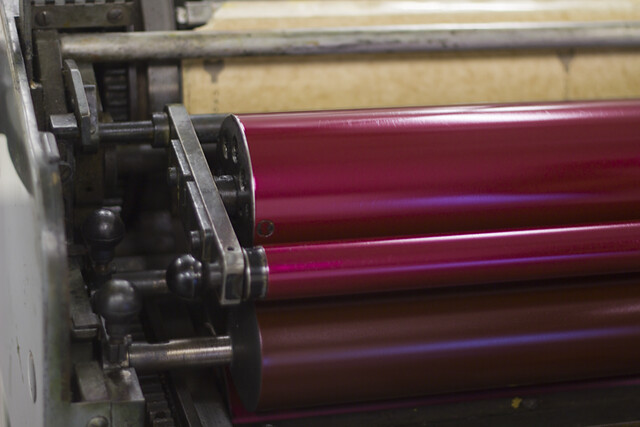
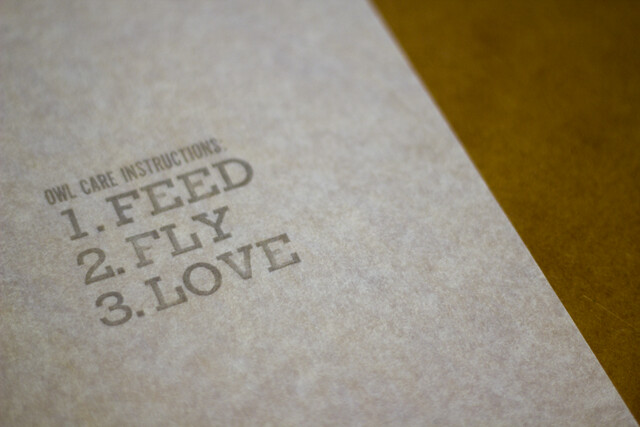
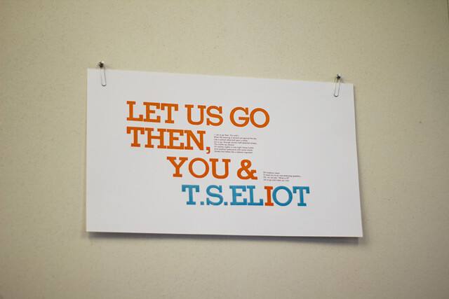
The highly coveted color was a dull turquoise or bright teal combined with a coral (example: the very last photo of the poster on the wall with a T.S. Eliot quote). Admittedly, it's a great, complementary color combination, but I personally prefer warm muted colors like mauve, mustard, olive, sienna, puce, etc. I loved looking at all the stencil blocks and type blocks and you can carve your own illustration or pattern on a linoleum block. Once the color has been mixed, it's time to do some rolling. Wait, actually, you need to figure out the placement of the type first. Since the type is backwards, the placement is flipped backwards, which makes the calculating a little more confusing. Practice rounds are a must in order to figure out the exact placement of the type. Once the placement has been calculated, the type has to be secured in place and then the rolling and printing can finally commence. Roll forward and then voilà! And then repeat as many times as required.
Shy has offered to help me design and make my business cards with this technique and I'm absolutely thrilled! I'd love to spend more time in this atmosphere and soak up all the energy or rather tired and exhausted energy. Thank you Shy for inviting me and making me feel super jealous at the same time. I had a blast watching them and reading Mere Anarchy at the same time. I need to do more activities and go to more places where I can take photos and immortalize these memories. When I start making money, I want to incorporate more fine art and crafty activities in my life, such as letterpress, silkscreen, printmaking, book arts, embroidery, knitting, sewing and many more.
